Load Details

A walkthrough of projects that created patterns for future designs.

  • Roles
  • Researcher
  • Designer
  • Deliverables
  • Hi-Fidelity Mockups for Desktop
  • Development Hand-off Documentation
  • Tools
  • Sketch
  • InVision
  • Abstract

Introduction

The Background

In our Transportation Management Software, loads are the focus. For example, a load could be a trucking company carrying 100 pillows from Raleigh to Manhattan. We have a mix of various screens developed over the last 20 years that reflect a load's details like the origin and destination, the items on the truck and the proof of delivery.

I led the creation of a new, consistent design for these details screens with the goal of users having one place to view all necessary information and complete common actions on a load.

Following are some examples of how I developed new screens using existing designs and the design system to create a consistent brand.

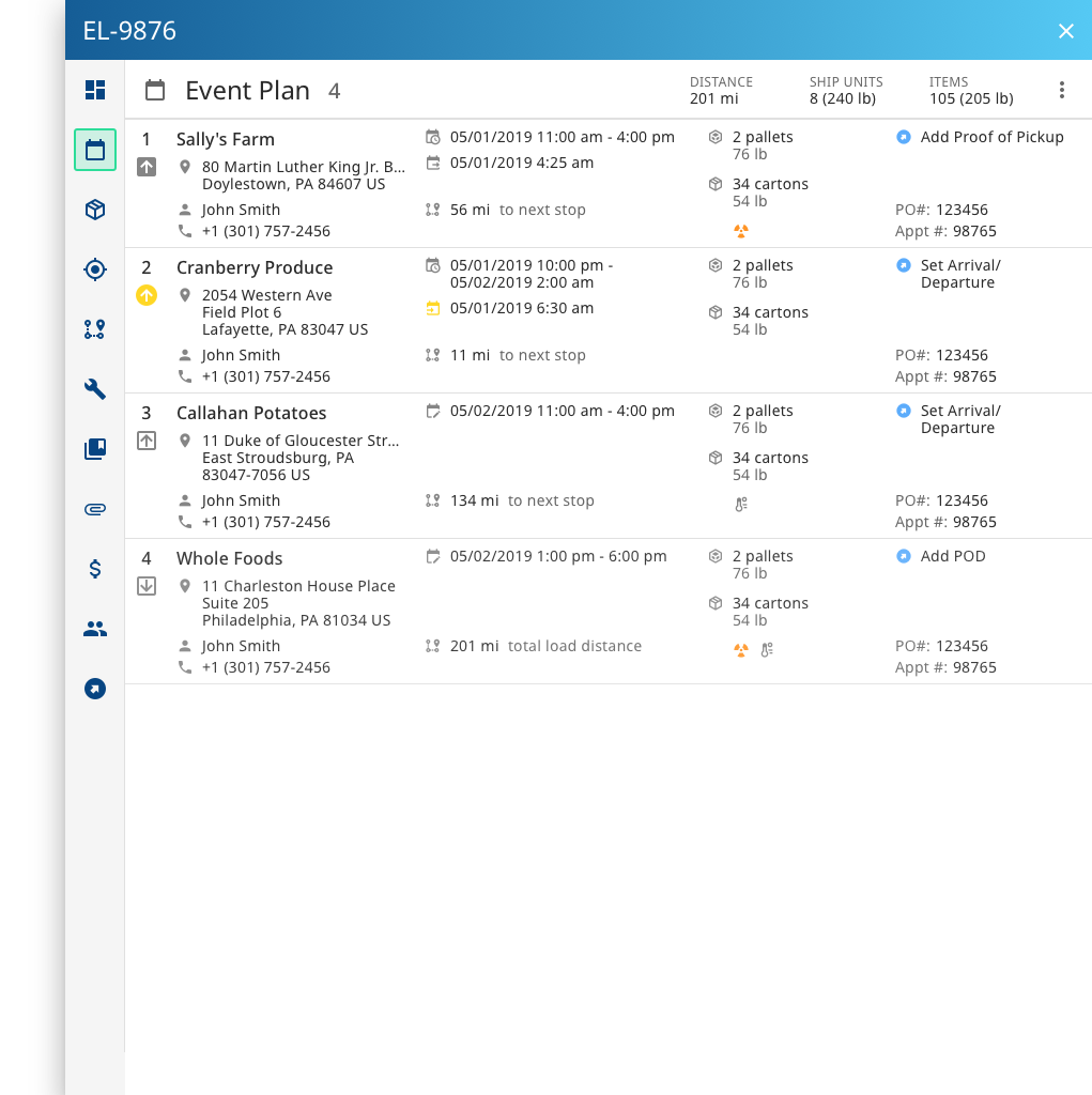
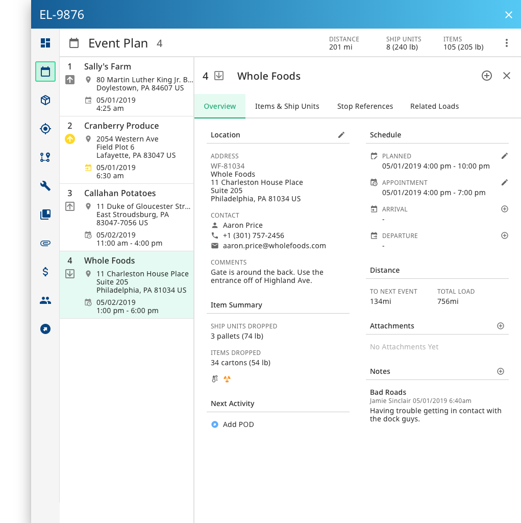
Patterns from the Events Tab

The Events Tab

The Events tab was the first tab to be designed for Load Details. For this tab, I started with a blank slate since there were no existing patterns.

There were many iterations on this design, but below are the design patterns that arose from this work.
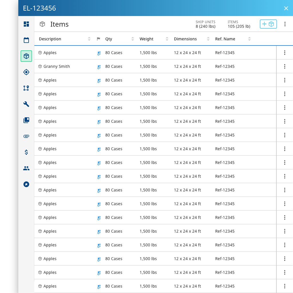
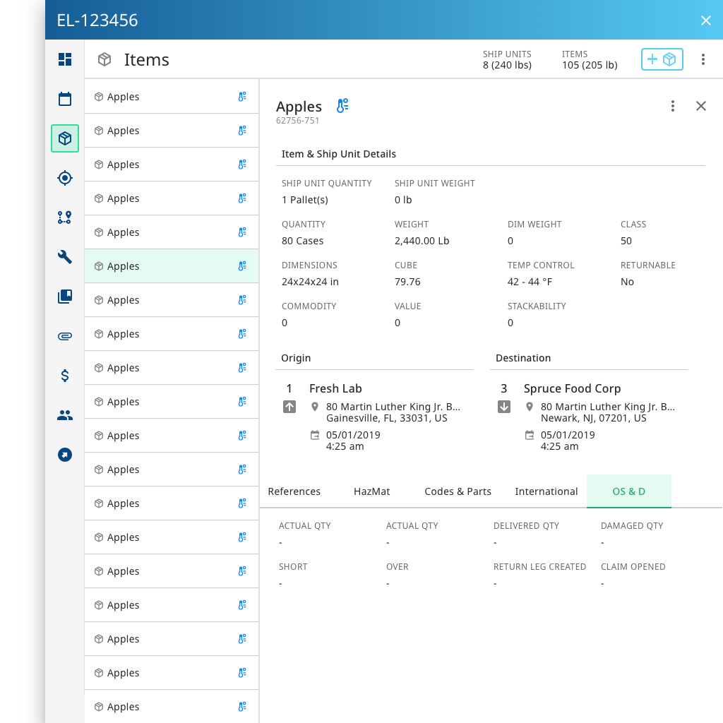
Events tab showing full event rows
Initially a user lands on a table view of the events. This view allows for easy scanning of primary information. A user can click on a row to expose more of the event's details.
Events Tab exposing an event's detail
After a user clicks on an event, the list of events minimize to the left of the drawer. A card displaying event details becomes exposed. The card defaults to showing the Overview tab which is the most important information. Secondary information resides on other tabs to which the user can easily navigate.

The Items Tab

This tab was originally completed by a team-member, but as we got closer to development there were some requirement changes that necessitated redesign.

The design of the Items tab was heavily influenced by the designs of the Events tab.

Items tab showing full event rows
Initially a user lands on a table view of the items. This view allows for easy scanning of primary information. A user can click on a row to expose more of the item's details.
Items Tab exposing an event's detail
After a user clicks on an item, the list of items minimize to the left of the drawer. A card displaying item details becomes exposed. This card is different in that it always shows the item overview which contains all the primary information. However, just like the Events tab, secondary information resides on other tabs to which the user can easily navigate.

Patterns from the Attachments Tab
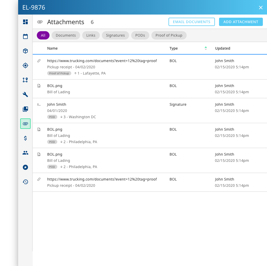
The Attachments Tab

Similar to Events, I used a table approach for the Attachments tab. One of the most important things to consider for Attachments is knowing which event that attachment is tied to. This can be very important for invoicing.

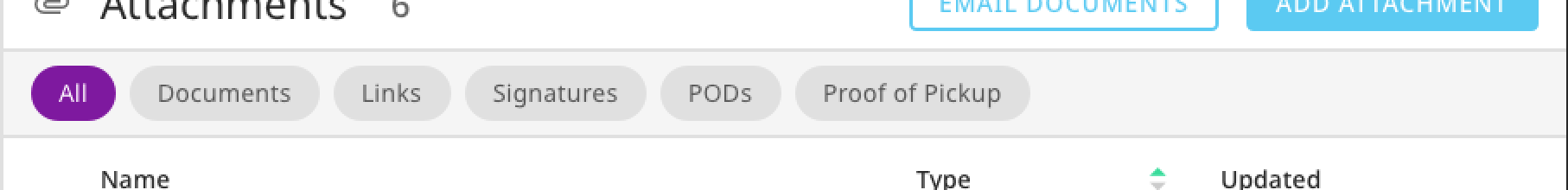
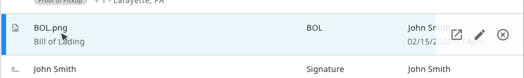
Patterns that came out of this design are the simple table with actions revealed on hover and filter buttons for quick document searching.
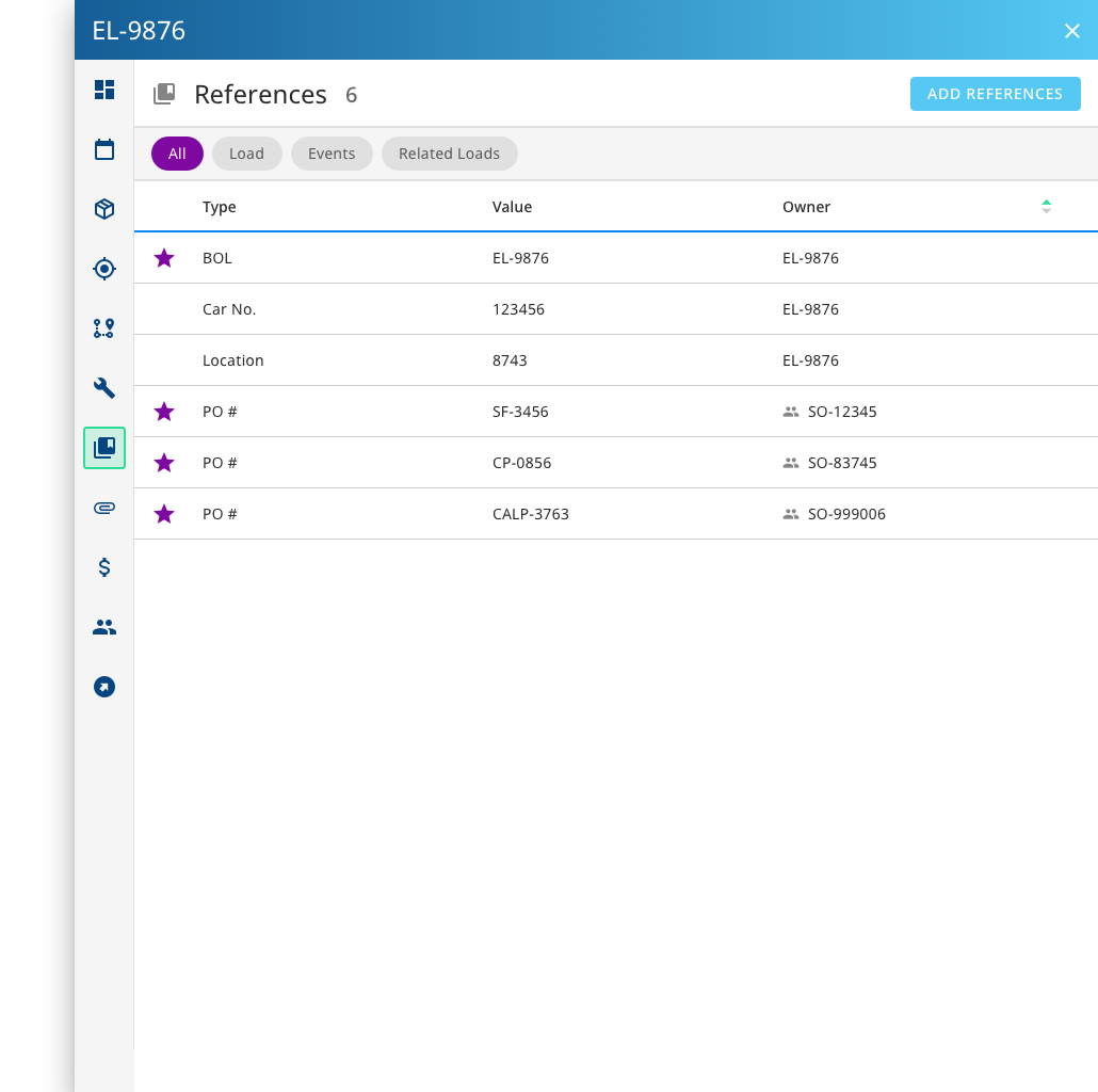
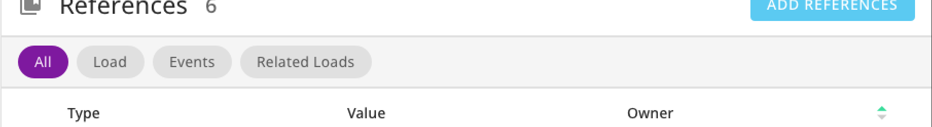
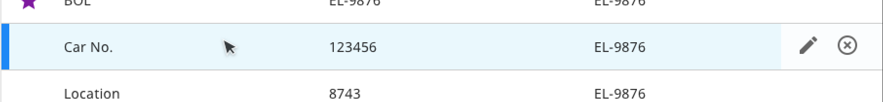
Attachments table
The Attachments tab has a table of documents, links and signatures where a user can easily scan for or sort by specific document types.
Filter buttons on Attachments tab
Filter buttons lie below the tab header so the user can easily navigate to the document types they are looking for.
Hover interaction over a row on Attachments table
On hover, the row reveals possible actions over a transparent background in case data is behind it. The row's hover interaction is the same as that of a different table that was recently developed to keep it consistent. Most often, a user is either viewing or adding an attachment which can be done by clicking the button in the top right of the drawer. It is less common to edit or remove an attachment.

The References Tab

After the Attachments tab was designed, it was relatively simple to mockup the References tab. References have less complexity, including just a Reference Type, its value and the load that owns that reference.

References table on references tab
The References Tab also features a table. This is a more simple table though, with only one piece of information in a column.
Filter buttons on the references tab
Similar to the Attachments tab, there is a simple table with the ability to filter results by clicking on a filter button. This helps users narrow down the list of references, which can be large.
Hover interaction over a row on References table
Hovering over a reference row has the same interaction as an attachments row. Possible actions are revealed on the right over a transparent background. On References, a user can only edit or remove a reference.

Patterns from the Add Screens

Just Keep Adding

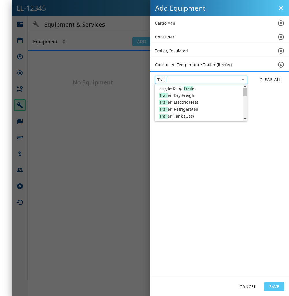
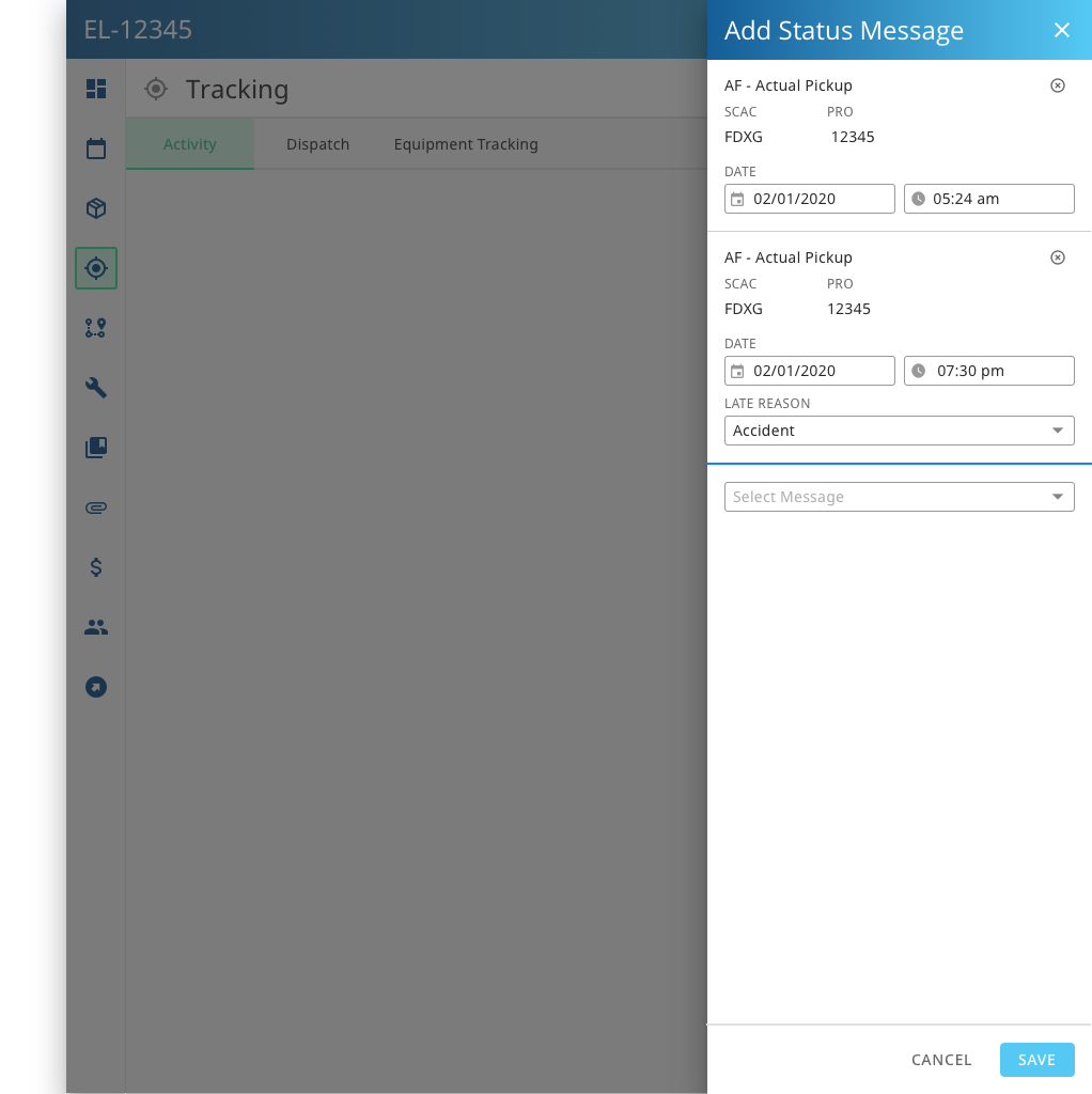
Adding details is one of the main actions a user can perform. My objective was to make the adding process consistent between tabs, so that adding equipment for a load is the same experience as adding an attachment or reference.

After a user clicks on a button to add a detail, a drawer expands. The user can start typing to search for values within the dropdown or they can manually select a value. As soon as a value is selected, a row is added. Depending on the context, a row could have more data to enter. This pattern was scalable and able to be applied to multiple pages.

Add Equipment Drawer
On the Equipment & Services Tab, the only action a user can take is to add or remove equipment and services. After a user clicks on the button to Add Equipment, a drawer opens and a dropdown displays. The user can continue selecting values until all Equipment is added, then press Save. This is exactly the same design for adding Services.
Add Tracking Message drawer
When a load is in transit, a user may want to add multiple status messages for more accurate tracking. The Add Status Message drawer is heavily inspired by the Add Equipment drawer. A user selects a status from the dropdown and a row is added with some details. However, each row has a few more details for the user to fill out.

Conclusion

On this project, I learned how important it is to consider multiple contexts when designing. A current design may impact future designs and scalability should be considered. I referenced previous mockups when doing new designs, but working on some of the new designs gave me ideas on how to improve some of the older designs.

This was a very iterative design process and designs continue to adjust as we develop these screens. Having a design system and defined patterns help make these quick adjustments.