- Roles
- Researcher
- Designer
- Deliverables
- Hi-Fidelity Mockups for Desktop
- Development Hand-off Documentation
- Tools
- Sketch
- InVision
- Abstract
Project Definition
The Background
What Is Carrier Rating?
In the transportation industry, there is a process called “Rating”
which is adding a quote from a carrier on a load. This quote can be
retrieved many ways, one of which is manual entry.
There are many configurations that can be applied to a manual rating screen, such as charge-level currency, charge-level references and distributing a charge amongst many loads.
Here is an Example:
-
I am shipping 100 water bottles. I need someone to carry them from Raleigh to San Diego.
-
I call up a carrier that I trust to do a good job. He says "I will do it for $500 plus 2 cents for every mile to cover fuel."
-
I enter the carrier information and the rate provided on the Carrier Rating screen and save it to my load of 100 water bottles.
The Problem
I was assigned this project because our customers are spread out over three different codebases. We needed everyone on the same, newest codebase. However, Carrier Rating wasn't the same on every codebase, so I needed to understand the differences and what customers actually needed to move to the newest codebase.
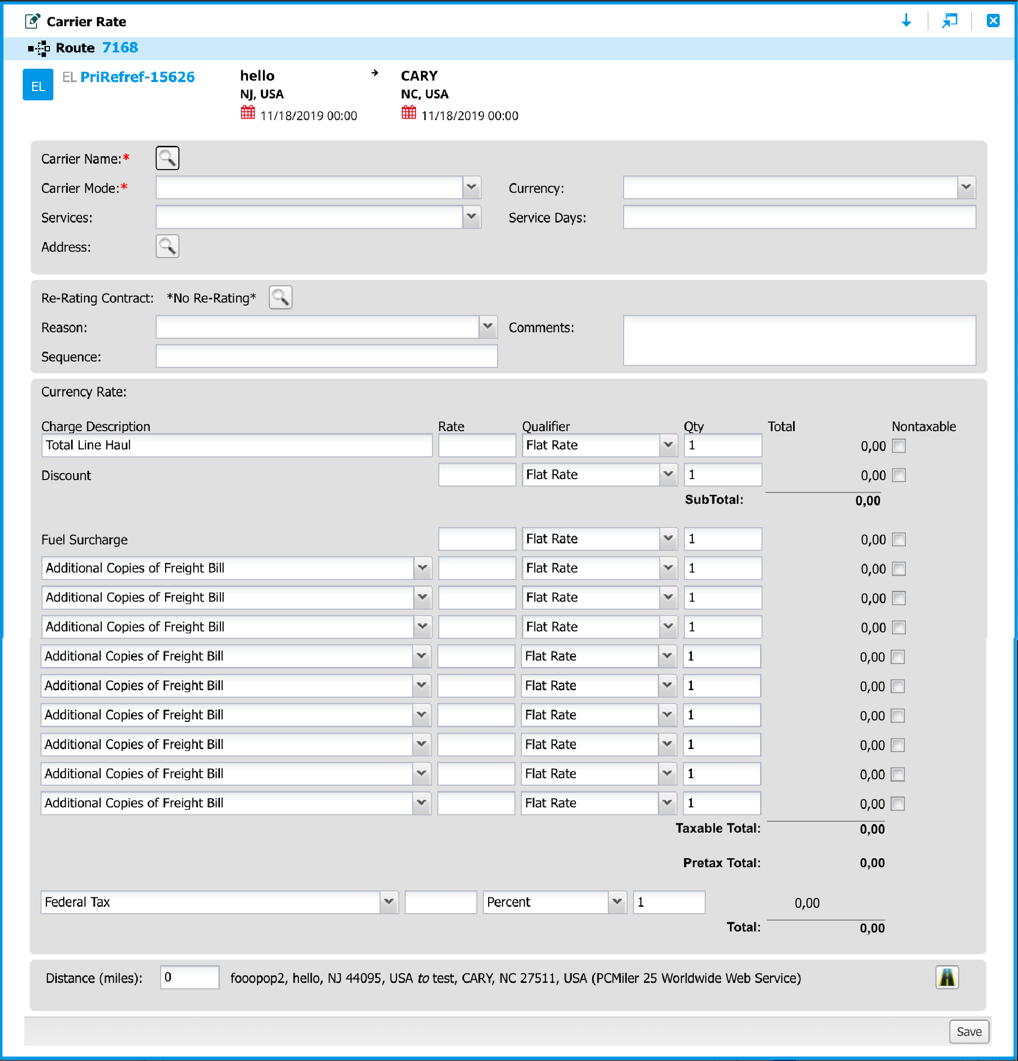
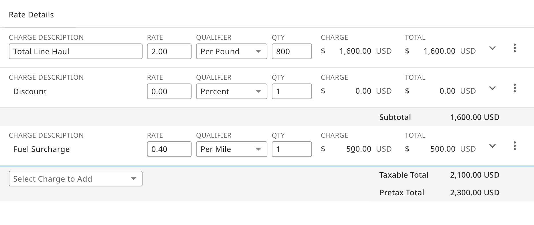
This is the original Carrier Rating screen that is still in use in the software.
The Solution
- Make the form quick and easy to submit
- Make it easy to add charges
- Hide secondary details
- Use new MercuryGate design system
This is the final design that I submitted to the development team.
Research & Discovery
UX Audit
There was a lot learning ahead of me. In order to fully understand the problem, my first step was to learn about rating and how it works in the MercuryGate software. This included external research as well as reading internal documentation.
I then reviewed the existing screens within the system and simulated various scenarios to help me understand the current interaction.
The external and internal research helped me learn the relevant terminology and customer use cases which would be important for communicating with stakeholders.
Stakeholder Interviews
I spoke to internal stakeholders including Product Managers, Business Solutions Architects and Implementation Specialists to learn how customers currently use Carrier Rating and to understand the pain points.
Design Research
I conducted a search on google and dribbble for some inspiration. I looked for invoices, receipts, rates and quotes to understand how charges and totals are written and read.
Design
Carrier Information
There were two areas of information that I tackled. The carrier information needed to be organized in a logical manner. I put all required fields on the left, as that would be the first area a user would see. For organizing the rest of the carrier information area, I considered data length, importance and the relationship between other fields.
The carrier information panel organized with required fields to left and other fields arranged by field length and importance.
Rate Table
When designing the rate table, I organized the input fields to match common receipt and invoice models. One of the issues with the existing screen was too much information on one line, cluttering the page with less important details. During the redesign, I prioritized the information and went through many iterations on a better way to expose the primary information.
This is an intial design that has a more table-like view.
This is a later design that has all the inputs on one line, but includes redundant labels.
Secondary Charge Details
In my design, secondary information was only exposed when a charge line was expanded. This helped the page remain simple and readable.
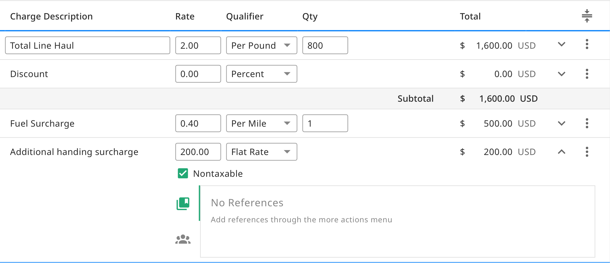
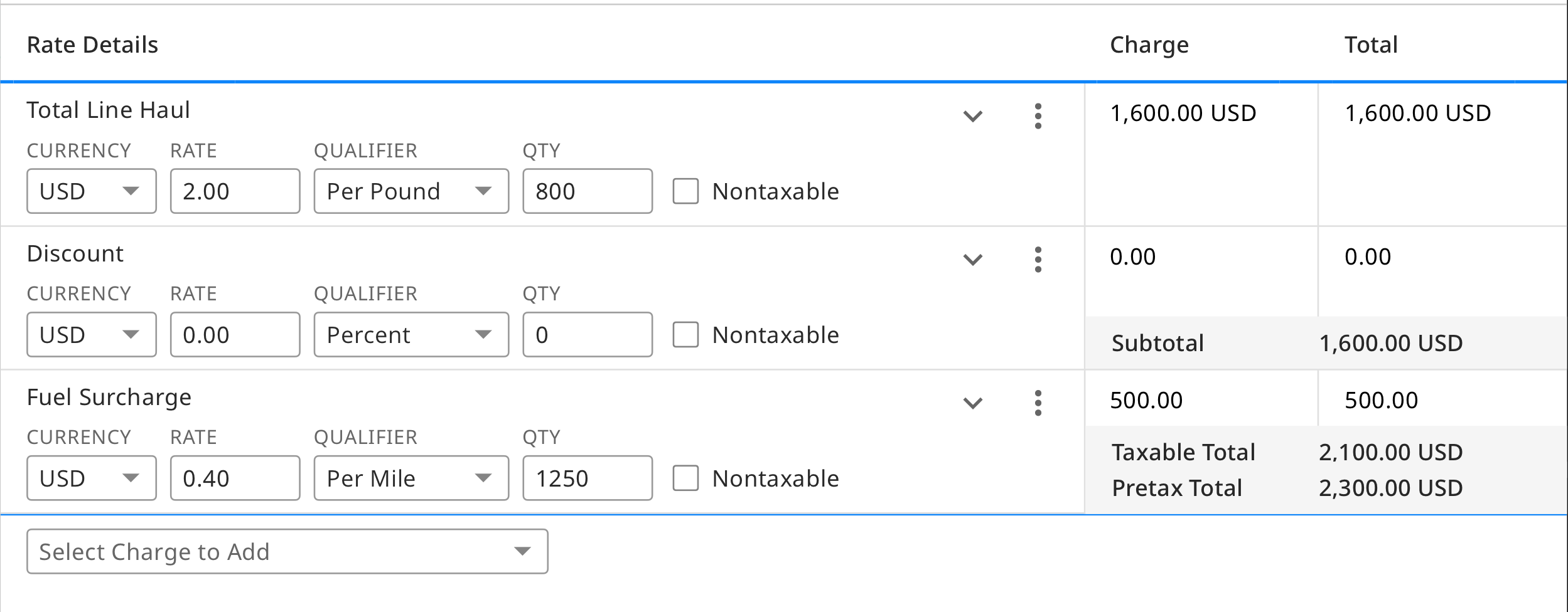
A charge row expands to show secondary information.
As I iterated on the designs, I reviewed them with the UX team and stakeholders.
Implementation
Ready for Grooming
As the development team was ready to start working on the new design, the Product Owner brought up some new features to include. Due to the simplification and scalability of the design, I was able to quickly add in additional fields. I held review sessions on these designs and then implementation was ready to begin.
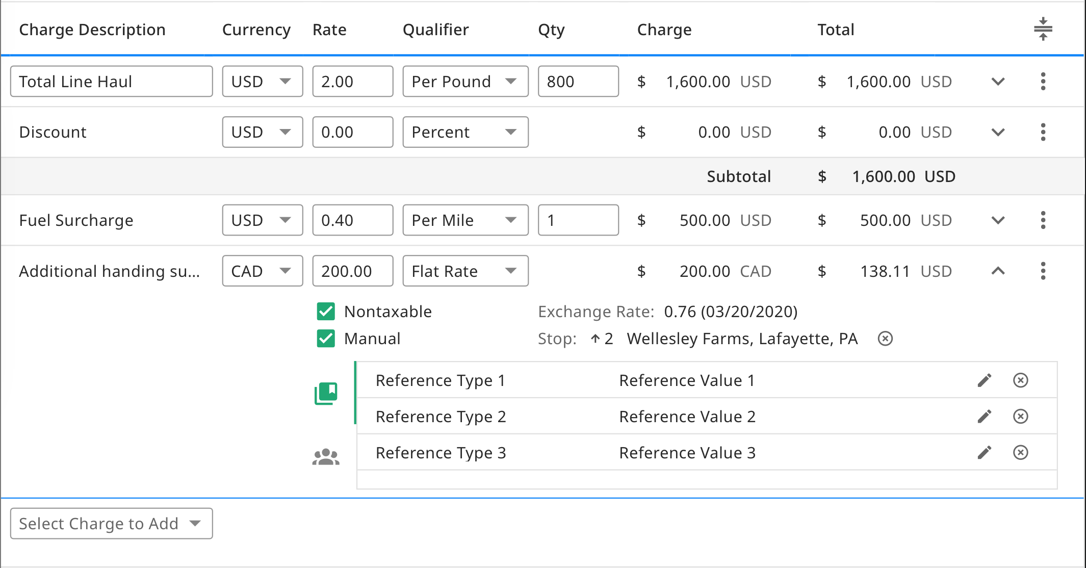
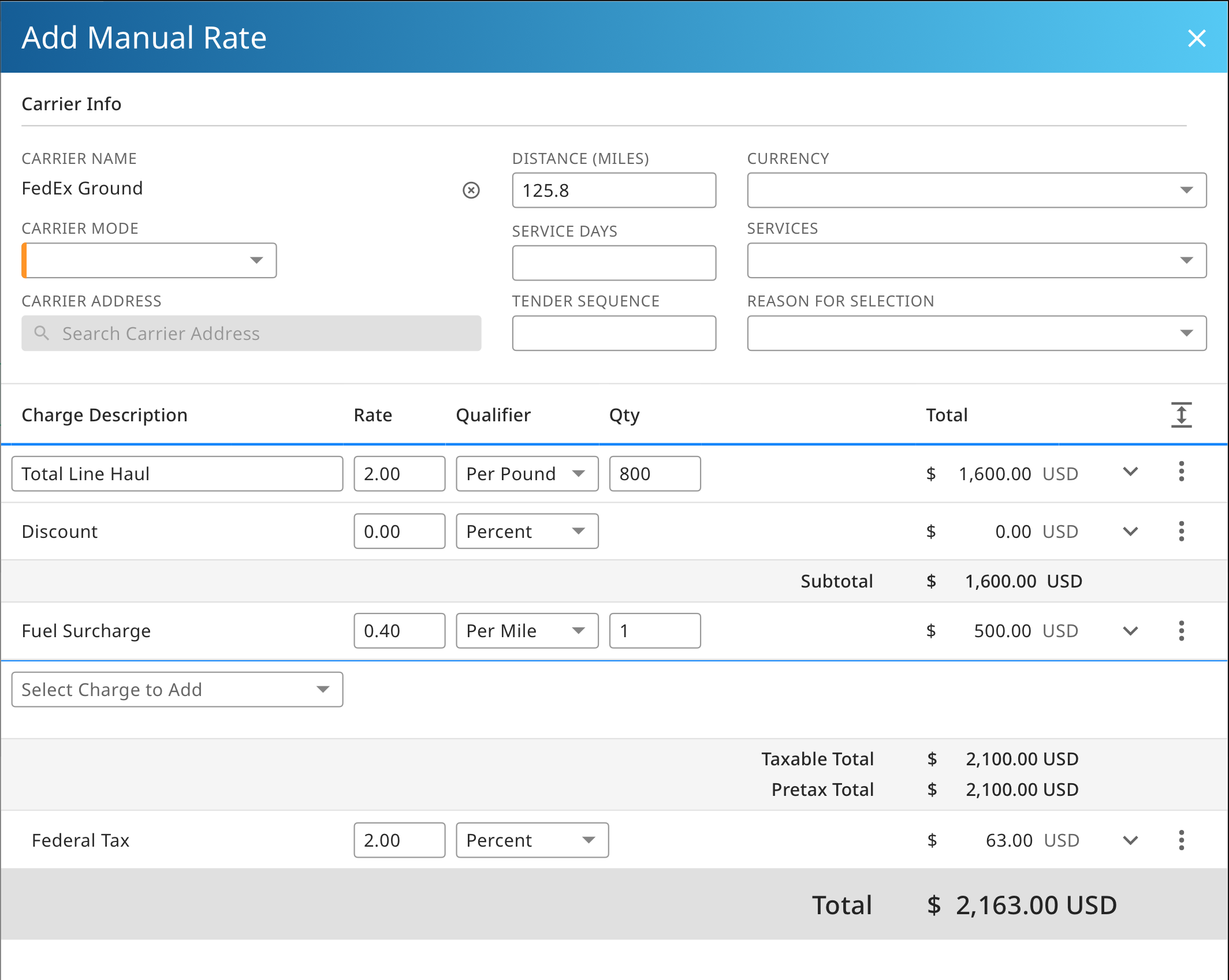
After talking with a Product Owner, additional fields were needed on each charge row. The current design was scalable so I only needed to make room in the expanded row.
In Production
The development team finished implementing the new screen and now our customers are using this newer version.
This is the legacy screen that customers use.
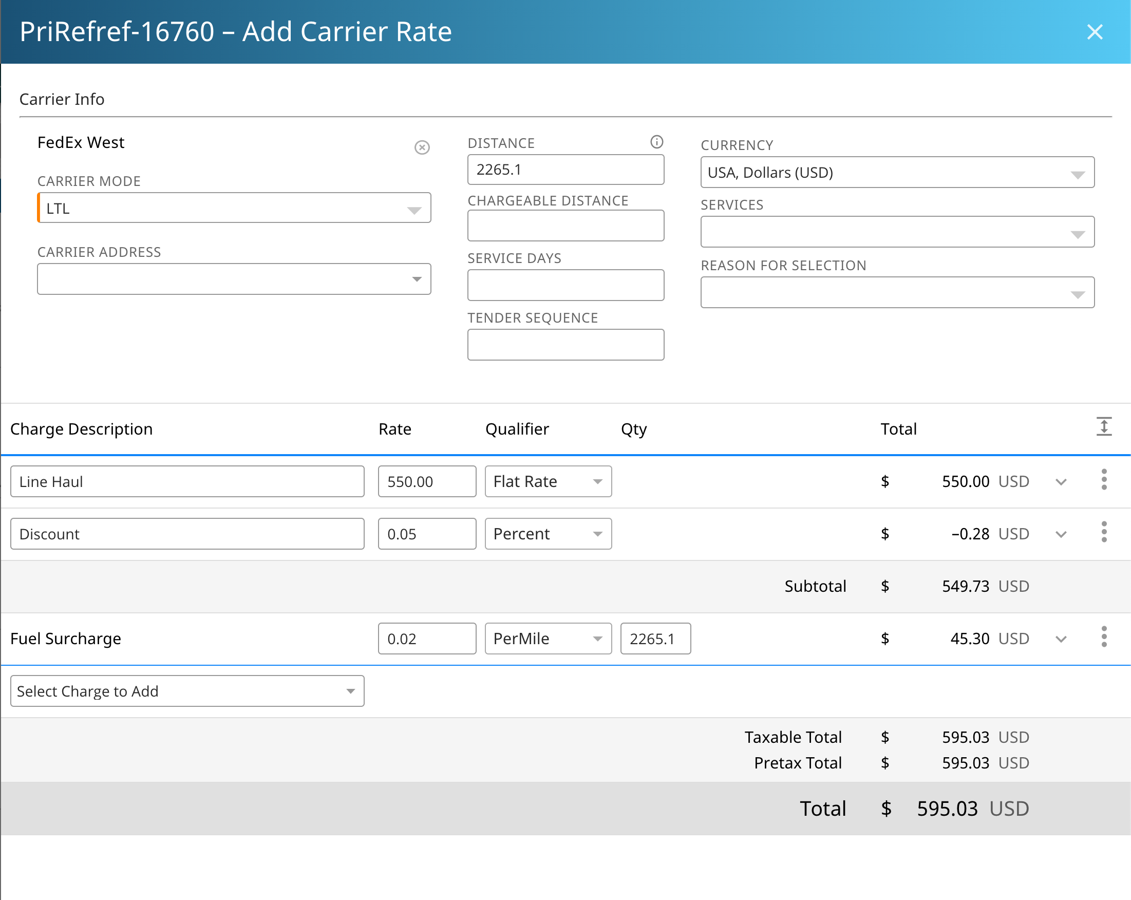
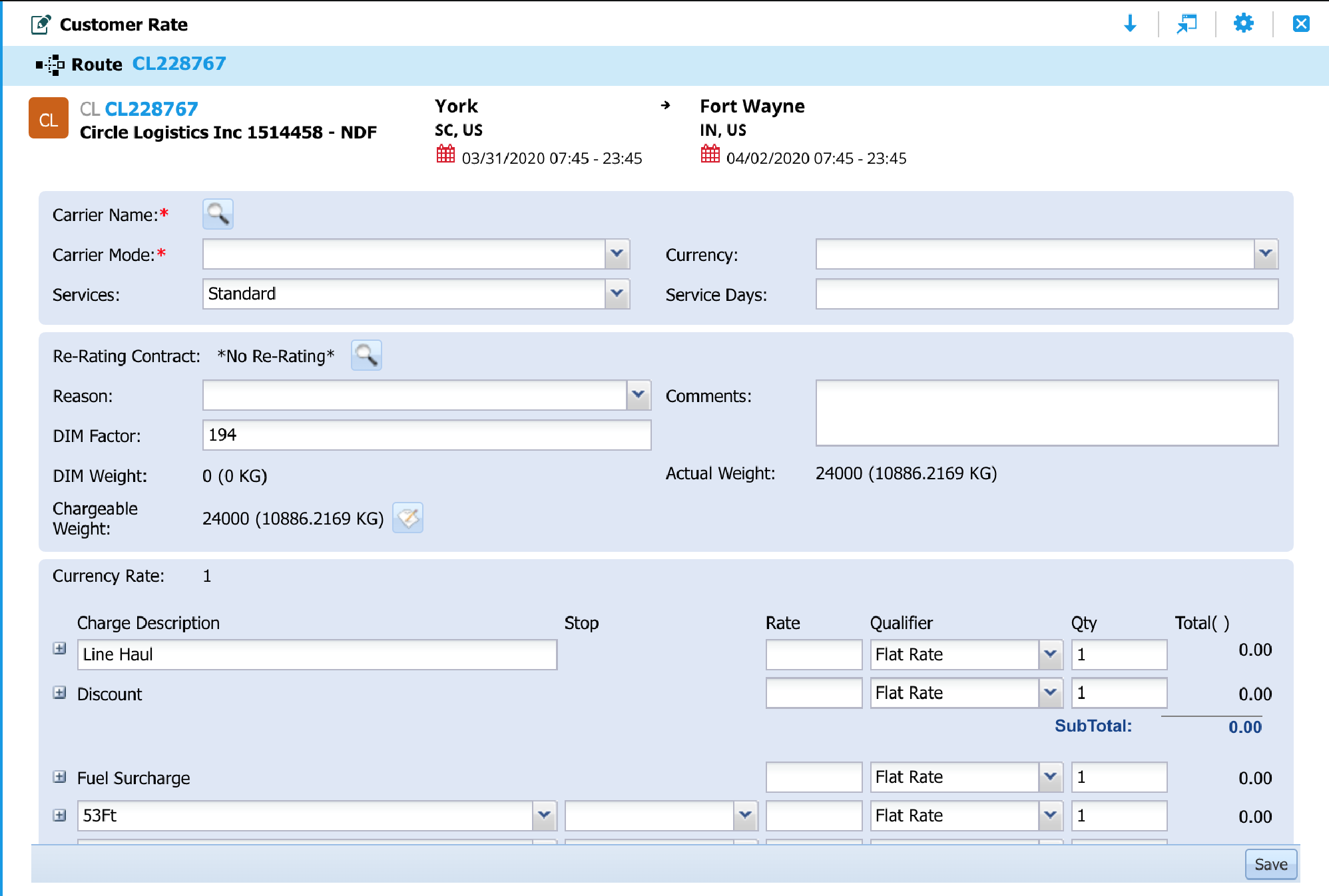
This is the newly developed screen now being used by customers.
Conclusion
I learned that interviewing stakeholders upfront for information and reviewing designs with them is an important way to make sure all use cases are accounted for. This results in a design on which all internal parties are aligned.