- Roles
- User Researcher
- Information Architect
- Visual Designer
- Prototyper
- Usability Tester
- Deliverables
- Sketches
- Wireframes
- Hi-Fidelity Mockups for Desktop and Mobile
- Style Guide
- Logos
- Tools
- Figma
- Sketch
- UsabilityHub
- InVision
Project Definition
The Problem
Here's The Scoop
There are so many sources for recipes: websites/social media, friends/family,
family, cookbooks and meal subscription services. Due to the difference in
sources, recipes come in many different formats. If you want to get
your Mom’s Mac & Cheese recipe - where do you go? Check your email?
Dig through a drawer? There needs to be a common place to store all
sort of recipes.
This is where Heirloom comes in.
But with a cloud recipes application comes some challenges:
-
Competition
Since there are so many storage applications available, I wanted to design one that was differentiated from the others to entice users to notice and try it, while maintaining core aspects of recipe apps that users had come to expect.
-
Complexity and Flexibility
A recipe on a website has cook time, servings, nutrition, ingredients, directions and images all laid out. A lot of this information isn’t immediately available if it’s a family recipe or from another source. This application should be able to hold all the important information without relying on all the information being initially available.
-
Simplicity
Current recipe sites are relatively complex. I wanted to design my app so that it was able to do everything that a recipe application needed to do without being overwhelming and difficult to use.
The Solution
- Enter recipes at whatever pace or level of detail you want
- Choose whether you want to upload a recipe card or enter ingredients and directions manually
- Organize recipes into collections when you add them or save that for later
- Search by ingredients or tags to make finding a cake recipe "a piece of cake"
- Share recipes with friends and family in a secure way so you can keep the secret ingredient a secret
Research & Discovery
User Survey
With 29 survey participants, I was able to learn how people currently use cloud storage apps, and what they like and dislike about these apps. I was also able to gauge interest in a recipe-focused app.
This confirmed the direction of the app and was extremely helpful in the creation and prioritization of user stories.
Take The Survey View The Results-
96%use cloud storage/organization apps
-
81%use cloud apps primarily for content storage
-
 Access from any locationFiles backed up remotelyEasy to use
 -
 Privacy/securityLimited storage spaceNot good for organization
 -
CURRENT RECIPE STORAGE80% drawer/box40% browser bookmark30% pinterest board
-
CURRENT RECIPE SOURCE100% web90% written recipe80% cookbook50% magazines20% food-delivery subscription services
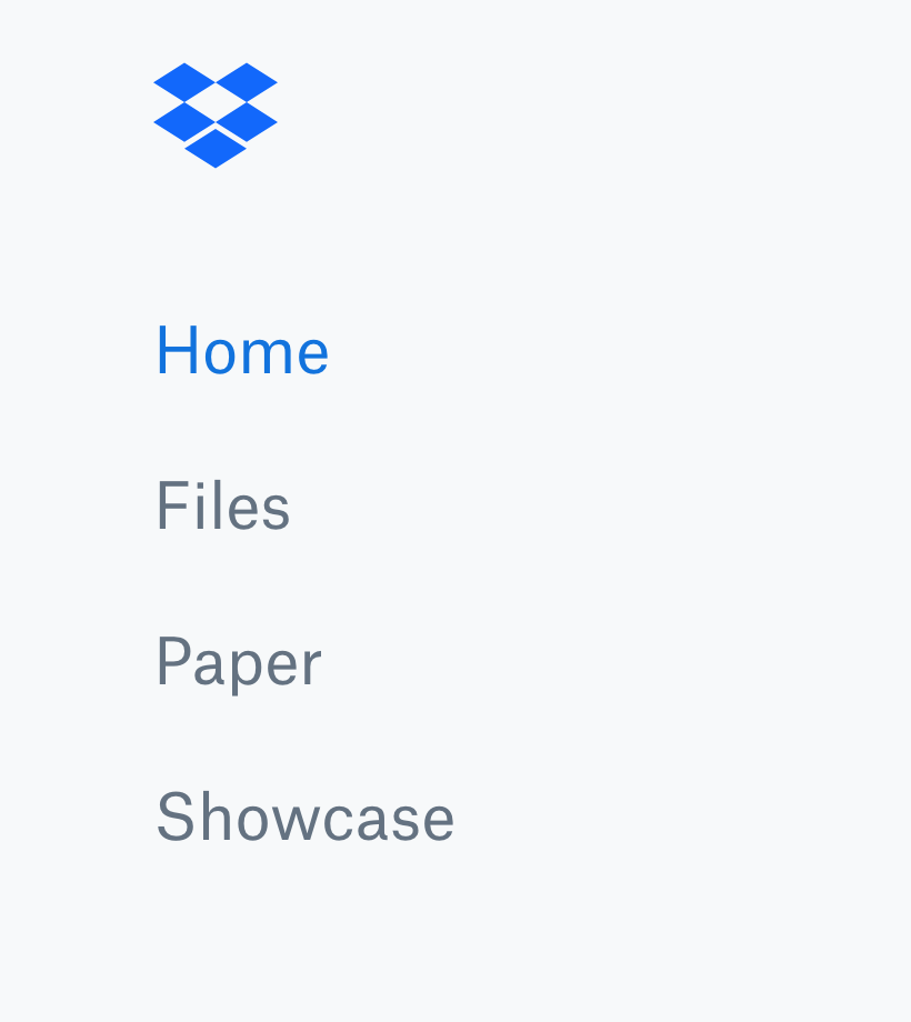
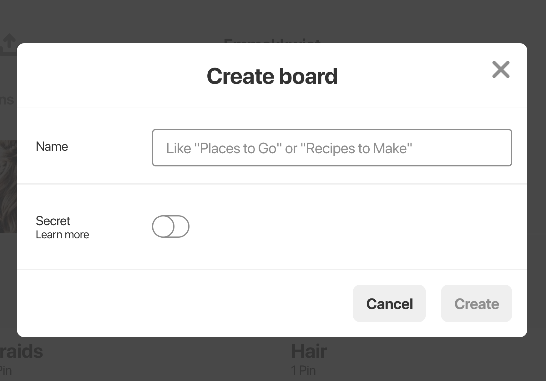
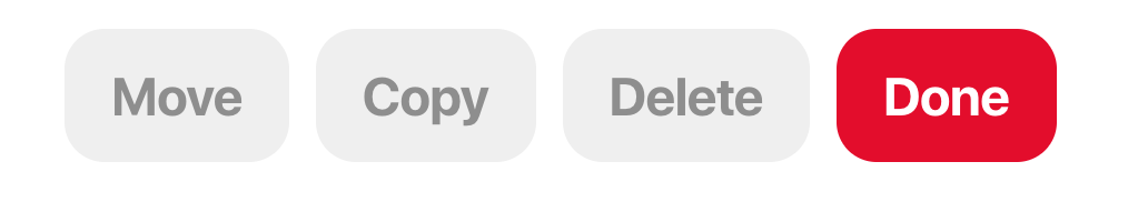
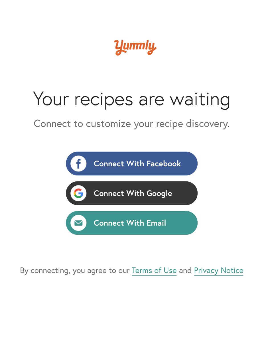
Competitive Analysis
I did a SWOT analysis of Dropbox, Pinterest and Yummly which helped me discover the aspects to keep and those to revise or create in my own application.
-

- Dropbox
-
Strengths
Simple branding
Ability to access files in many ways
Collaboration abilities
Easy to navigate -
Weaknesses
Lack of customizations
Lack of personality
Desktop app not as feature-rich as mobile app
-
-

-
Strengths
Customization of pages
Many ways to organize content
Many ways to share content
Browser extension available -
Weaknesses
Adding a pin is not in top menu
Hard to differentiate ads and friends' pins
No "go-to-top" button when scrolling
-
-
-

- Yummly
-
Strengths
Save or share recipes
Create a shopping list off of recipe
Organize recipes into collections
Education on cooking techniques -
Weaknesses
Cannot filter or sort recipes
Cooking techniques combined with other articles
Recipe directions are difficult to read
-
User Flows
The onboarding flow was easy since I was able to reference Yummly’s process. I also created flows for sharing, organizing and adding recipes.
I used the user stories to determine what should be included in these flows and utilized the other user flows I created for Dropbox and Pinterest to guide me.
See All User Flows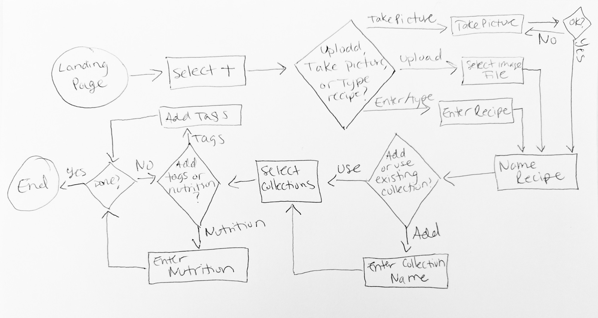
Original sketch of the user flow for adding a recipe.
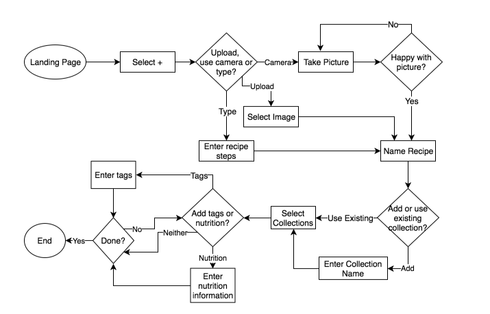
Original user flow for adding a recipe created with draw.io.
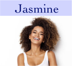
User Personas
How would someone use this application for their family recipes versus recipes found online?
What kind of information will this user need or want for a recipe?
What demographic is this being designed for?
Answering all these questions helped me determine different use cases for this application which helped me create and prioritize user stories and design the application itself.
See All Personas-
-
-
Age: 22
Occupation: Journalist
Location: Atlanta, GA
Gender: Female
-
- “I don’t know too much about cooking so I call my mom a few times a week to ask her for a recipe or how to do a certain cooking technique like sautéing.”
-
-
Goals
1. Save shared recipes
2. Have a shared collection of recipes
3. Place for recipe tips/comments -
Frustrations
1. Too many places to share recipes
2. Not one place to save recipes
3. Does not know all the cooking techniques required
-
Goals
-
Motivations
Jasmine just graduated from college, moved to a new city and started her first job as a journalist for a local paper. As it's her first time living on her own and she didn’t cook much in college, she is now in charge of her meals for the first time ever. She loved what her mom always cooked and she wants to have those on file. Right now when she needs a recipe, she calls her mom and her mom will email or text it. Jasmine is frustrated because she never knows where to go to find that recipe her mom sent her that one time and she has to ask her mom to resend the recipe often.
User Stories
From the survey and many iterations of testing, I received a lot of feedback on features people would like to see in a recipes application.
I sorted through the feedback and determined which features would be mandatory for the Minimum Viable Product. I also learned which features would be great to add, as well as which could be included in a subsequent version of the application.
Here is a sample of the user stories ranked by priority.
- enter recipes manually
- share a recipe with a link that can be copy and pasted
- create a collection to group recipes
- save recipes from the web
- edit a recipe
- search recipes by ingredient
- upload pictures of recipes
- add tags to a recipe
- add nutritional information to a recipe
Design, Prototyping & Usability Testing
Sketches
I iterated many times on many of the screens.
Designing the “Add Recipe” screens were the toughest to figure out. There needed to be room to add a lot of recipe information in an easy and efficient way.
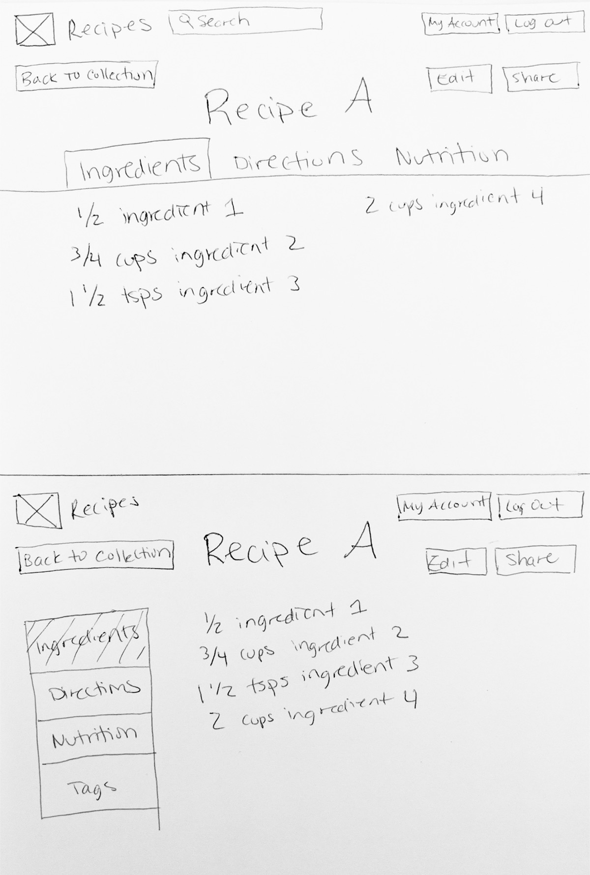
Sketches of different versions of the finished recipe page.
Sketches of different versions of the “Add Ingredients” page.
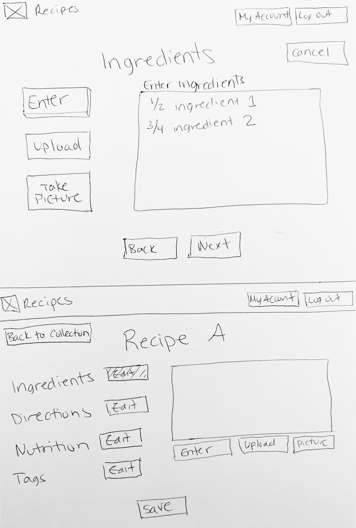
Wireframes
Going through the process of creating wireframes and testing them put the user flows into perspective. After creating some screens needed for adding a recipe, I realized that some screens should be reordered and some aspects needed to have a more in-depth review.
The usability testing of the wireframe prototype revealed that the processes for adding a recipe and organizing a collection were confusing to users, so it was important to redesign this aspect.
- All the font was too large
- Recipe sharing was not complete
- Users were confused about next steps in the process
- Upload and Use Camera options confused users
Branding
Determining the font styles and the primary branding colors greatly improved the efficiency of creating the mockups. It gave me guidelines with which to begin my work. Once I could see how those branding decisions affected the designs and prototype testing, I was able to revise the app. I decided to remove the darkest color from the styleguide as that was never used. I also tweaked the icons and removed the logos that were likely not to be used.
I also spent some time on logo design. The shape of the tomato changed. I also varied the coloring and brand fonts. I then tried some different text placement. I ended with this logo which I was happy with as it was my first logo design. See Full Style Guide
-
Font Families
-
Lobster Two
This font is only to be used for the brand name.
heirloom
-
Muli
This font is to be used for all text other than the brand name when being used as a logo. When it is unavailable, a sans-serif font should be the default.
- Aa
Regular - Aa
ExtraLight - Aa
SemiBold
- Aa
Italic - Aa
ExtraLight Italic - Aa
SemiBold Italic
- Aa
-
Lobster Two
-
Color Palette
-
Primary
dark red
#CA3C25 -
Secondary
green
#7FB069 -
rose
#E85B45 -
light pink
#FB7A65 -
gray
#474846 -
light gray
#EFEDED
-
Primary
-
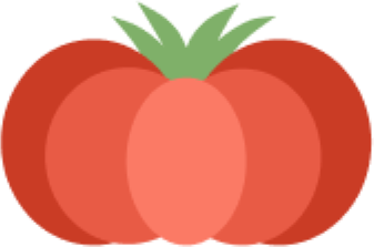
Logo without text -
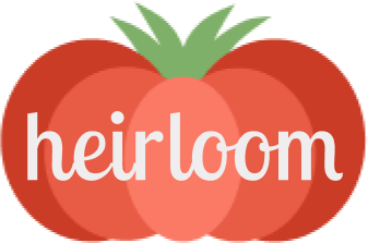
Logo with text -
Grayscale logo without text -
Grayscale logo with text
High-Fidelity Mockups
Round One
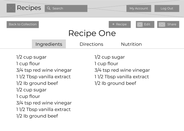
The first mockup I created attempted to mimic an actual recipe card. The feedback from the usability testing that most greatly influenced the final design was how different the “add recipe” screens were from the “view recipe” screens. Being able to visualize the end-result when creating the recipe is extremely important. Overall, the process of adding a recipe could be simplified and the hierarchy of the home page also needed some adjustment.
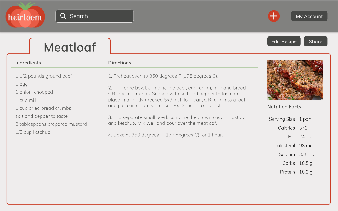
- Made recipe page look more similar to a real recipe card
- Reduced screens by having more information on one tab instead of multiple
- Added branding colors, icons and logos
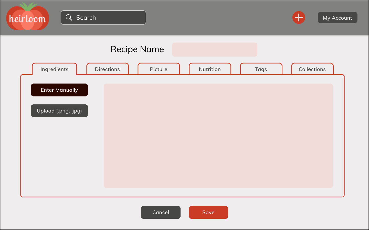
- User can see all the steps of adding a recipe
- Look of adding a recipe matches the look of the finished recipe page
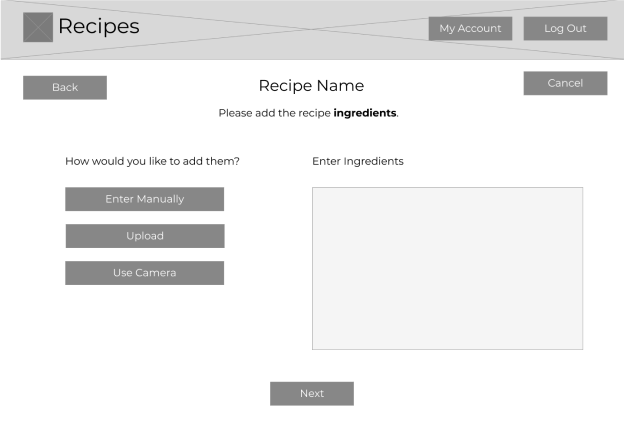
Round Two
Using the feedback from the design critique, I created a second hi-fi mockup. It kept similar styling but laid out the information on the page in a different way. The “view recipe” screen more closely matched the “add recipe” screens, but the design was still just a little too bland and the process of adding a recipe needed some rework. Users needed to be guided through the process and didn’t know where to begin adding a recipe.
- Organizes information in a way that shows more information clearly with less buttons
- All font sizes were reduced
- Layout was slightly modernized
- Keeps everything on one page instead of different tabs
- Makes adding ingredients and directions easier
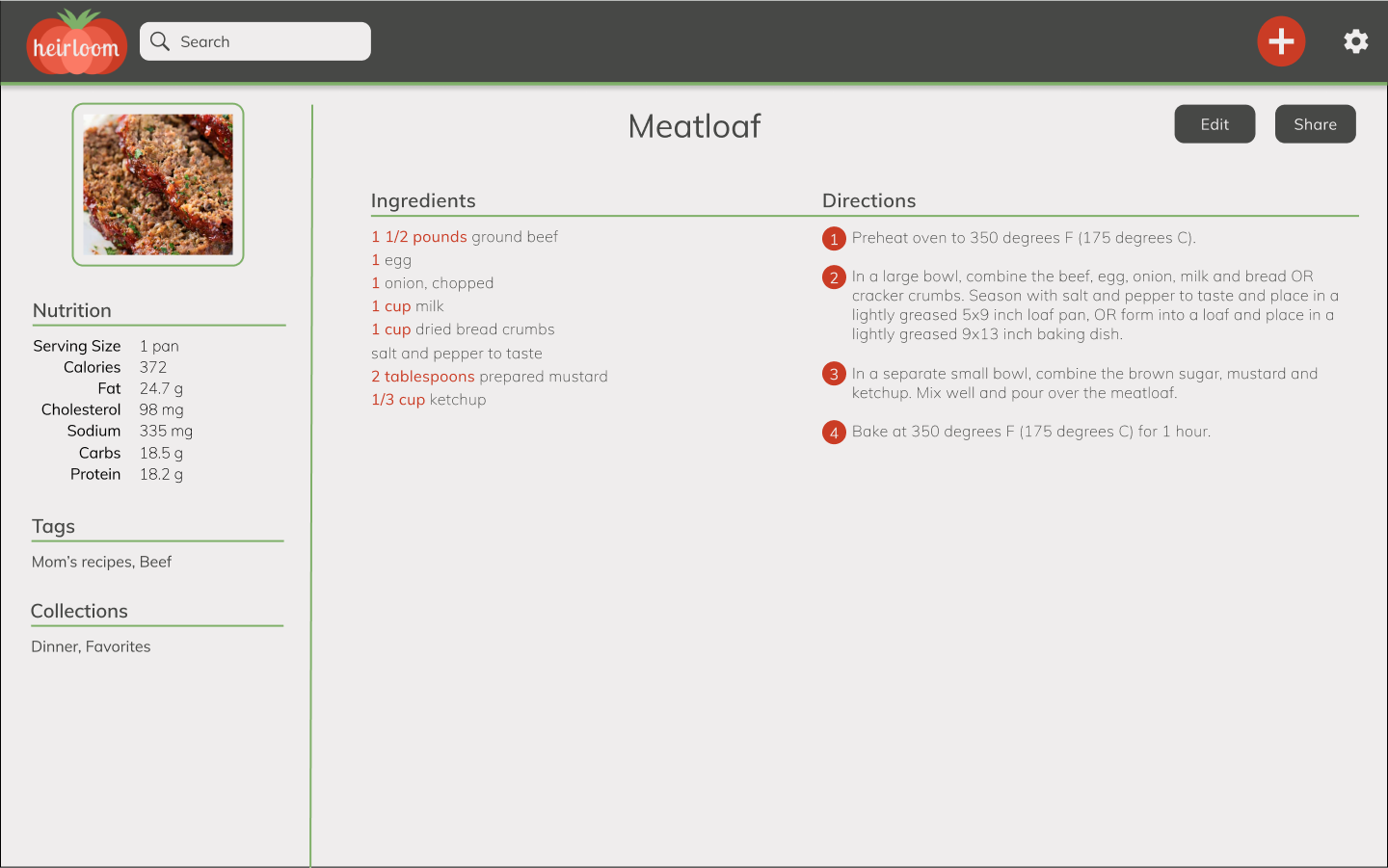
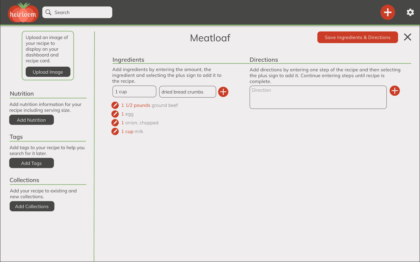
Round Three
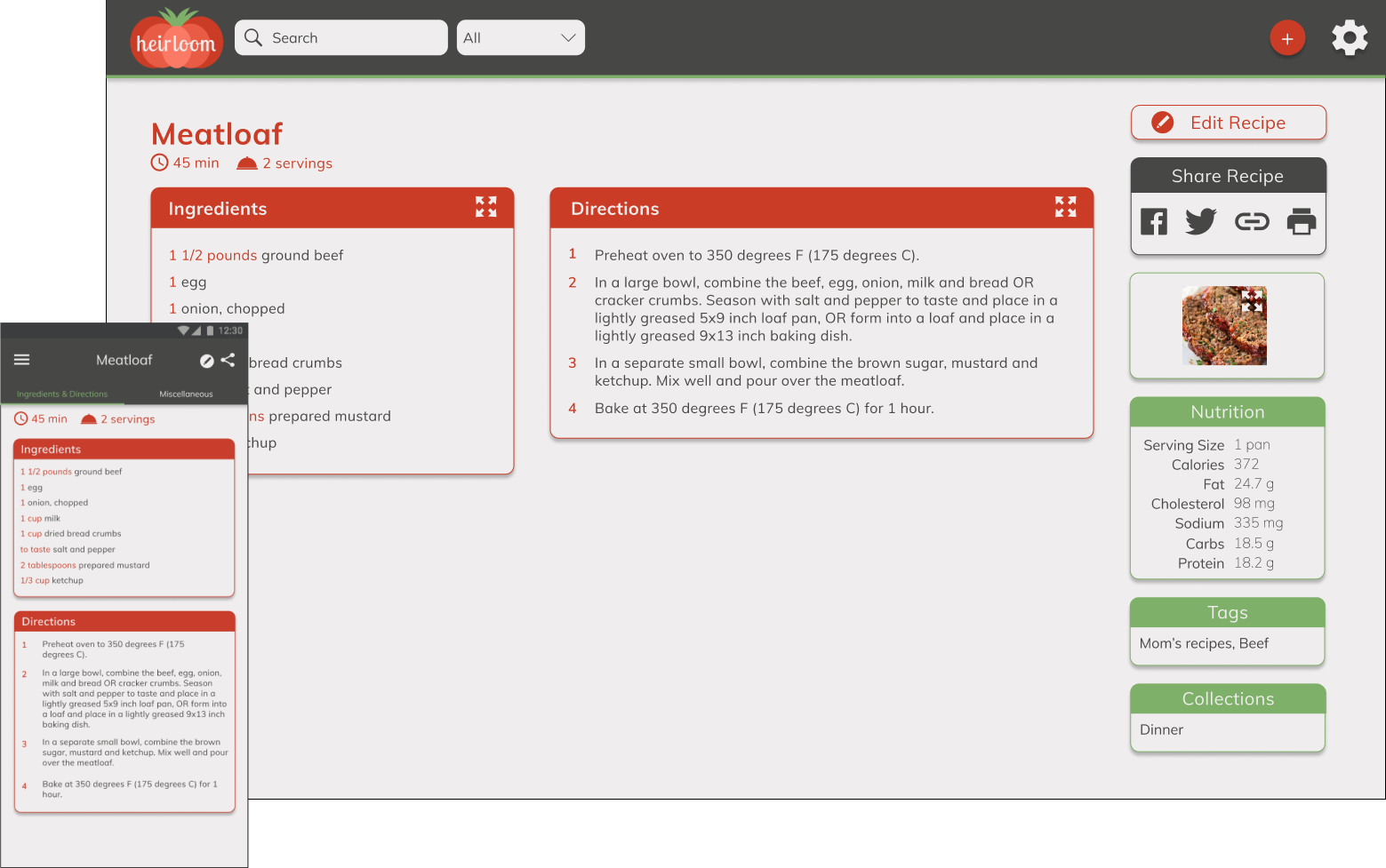
The third mockup was a lot cleaner. The “add” and “view” recipe screens matched exactly and users had a much easier time adding a recipe. They knew where to begin and felt like this would be extremely useful when actually cooking. The one thing that lacked in this version was the branding. It was missing the “homey” and “rustic” feel that the home page had. It was also missing some information that users were asking for such as Cook Time and Servings.
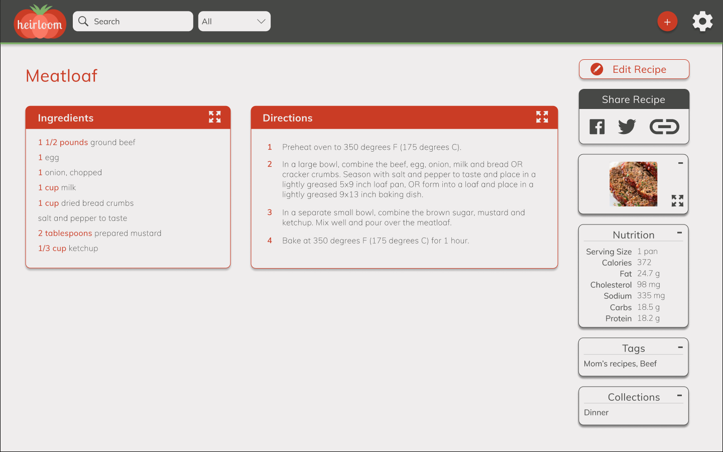
- Presents the information in a customizable card layout
- Expandable ingredients and directions areas for easy reading while cooking
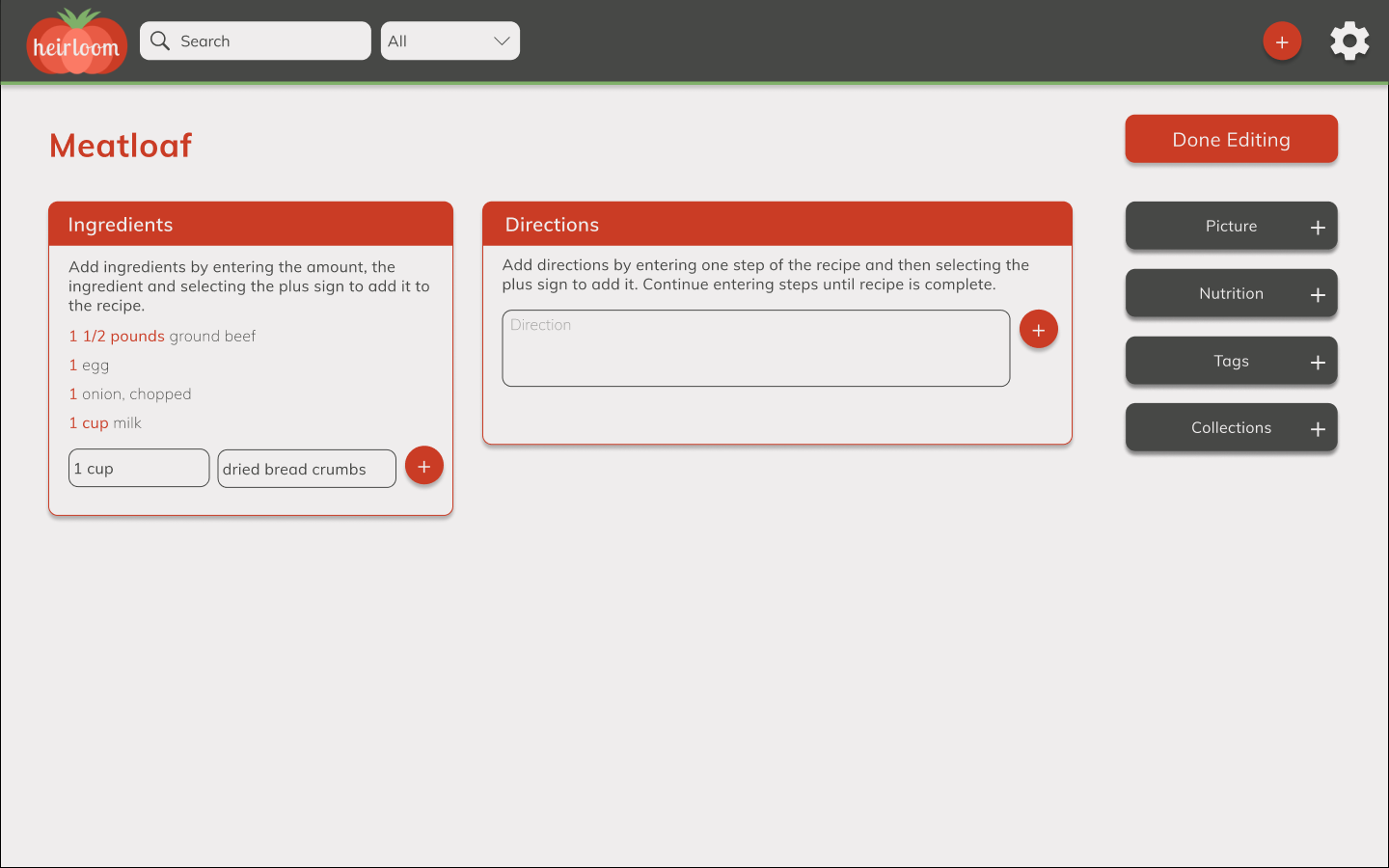
- Card layout makes it more obvious that all the information is optional
- Keeps the screen cleaner if the user does not have all the information like the nutrition data or an image
- Inputs to add ingredients and directions were moved to the bottom of the panels so it more closely reflects how you add items to a list
Round Four
The final mockup added the missing information, a “Print Recipe” icon and adjusted some font and icon sizing. The designs were all updated to make sure that branding was consistent and clean.
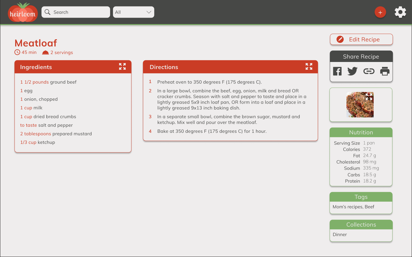
- Adds more of the branding colors back in
- Includes some missing information like cook time and number of servings
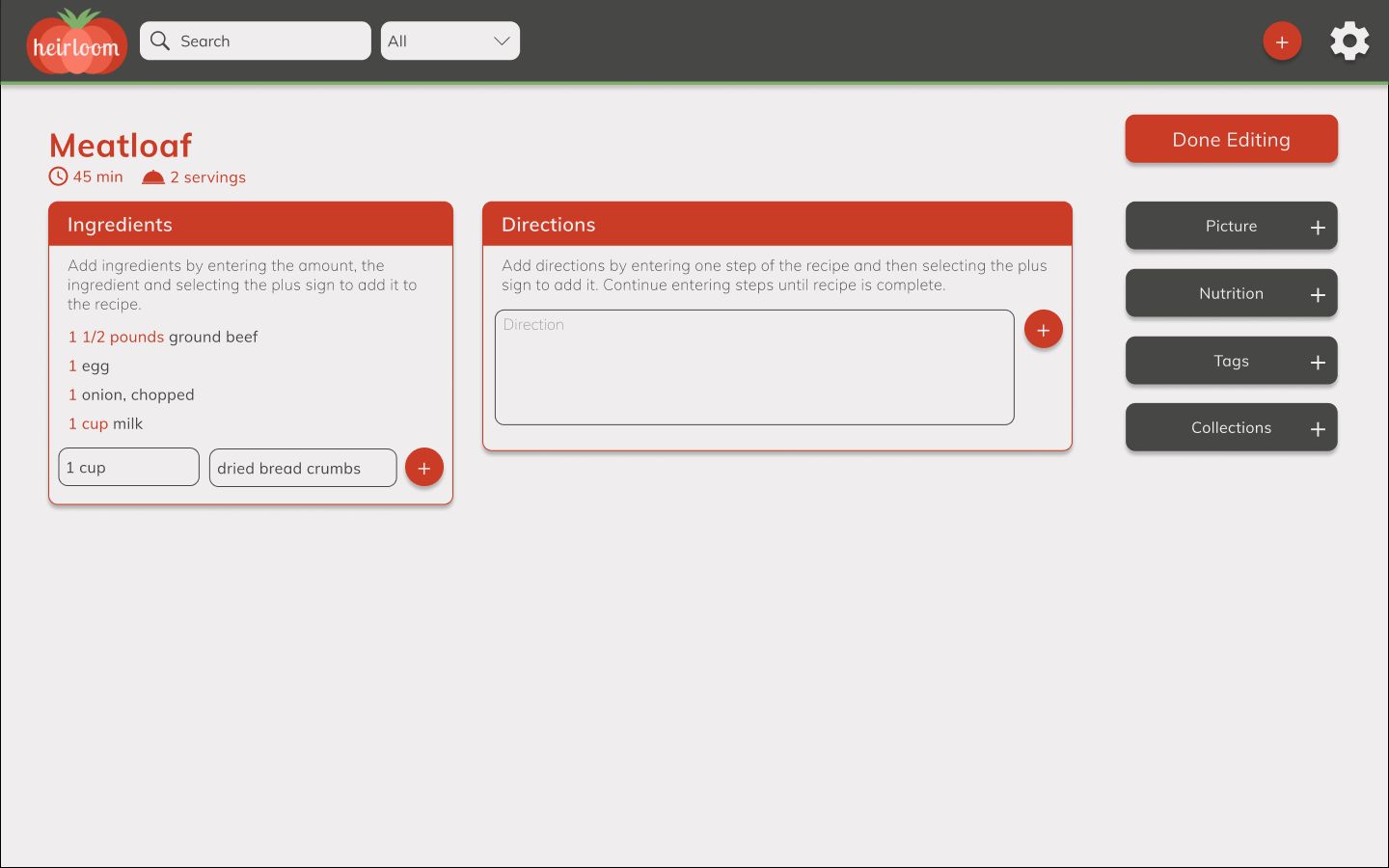
- Includes cook time and number of servings
There was a prototype for almost every version of high-fidelity mockups, but here is the final prototype which allows the user to create an account, add a recipe and view the recipe.
View PrototypeConclusion
Recipes are more complicated than I thought, but all the users who tested were excited to use this application. I learned a lot about the importance of simplicity, consistency and hierarchy when designing an application. Also, finding inspiration from existing sites and designs is key for having a design that matches current trends.